In 2019, the New York Times published an article addressing the inequalities of the public WiFi system in New York. The author, Annie Correal, stated that "LinkNYC was supposed to digitally unite the city, but the neighborhoods that need it the most have been left out." Following this statement, we used geospatial data to visualize the story of the LinkNYC Kiosks' locations and inequality across the city. Moreover, we identified this digital system's different elements and described the visualization's iterative process.
Acknowledgment
At the beginning of our process, we questioned whether NYC Link Kiosks are a Hard or Soft System. Since the physical structure is part of an interconnected network of agents, nodes, and flows, we decided to classify it as a Hard System. However, we acknowledge that this is a topic for debate and are open to discussing it further.


Analysis
The LinkNYC system is a physical communication network, replacing the payphone booths in New York City, USA. Their website states that "Each Link provides super fast, free public WiFi, phone calls, device charging, and a tablet for access to city services, maps and directions." Next to being a public access system, the screens function as advertising space and generate millions in revenue for the city.
- Network: the data transfers
- Nodes: the physical kiosks connected to data
- Agents: people interactions with the physical booths
- Flows: interactions with the touchscreen, WiFi, or cellular network
Process
To kickstart the project, we researched controversial data debates in the news the past year to find interesting topics. Also, we required inspiration from various interactive visualizations by other academia. Our process was iterative but best described as following:
- Create a challenge: "Can we visualize if the NYC public WiFi access points are accessible for those who need them the most?"
- Gather supporting datasets: retrieved from NYCOpenData & US Census
- Analyze datasets:: discover the quality of data, location mapping, + the possibility to map a neighborhood's income or inequality level.
- Find fitting tools: research tools that feel familiar (Javascript, D3js, Mapbox, and ThreeJS) or completely new (ArcGIS, Carto, Geopandas, or Keplar).
- Inspiration and art direction: gather other geospatial data visualizations that are functional yet aesthetically pleasing.
- Proof of concept: decide on a tool, dataset, storyline, and angle. Combine this as quickly as possible to create a first prototype to show the proof of concept.
- Interface Design: from a User Interface (UI) and User Experience perspective (UX), we decided to wrap the data visualization and written story in a website to give users a consistent digital experience. Therefore, we designed an interface in Sketch.
- Data visualization: start building, layering, and improving data in the visualization as a standalone product if we walk into any bugs or unforeseen problems.
- Frontend Development: create a simplistic wrapper allowing the visualization and report to be inserted into a custom-built website.
- Backend Development: synchronize data with the frontend and host the datasets on a personal server to be future-proof.
- Launch & Test: deploy the website to a custom server and publicly assign a URL to share the website. Test the website on multiple

Features
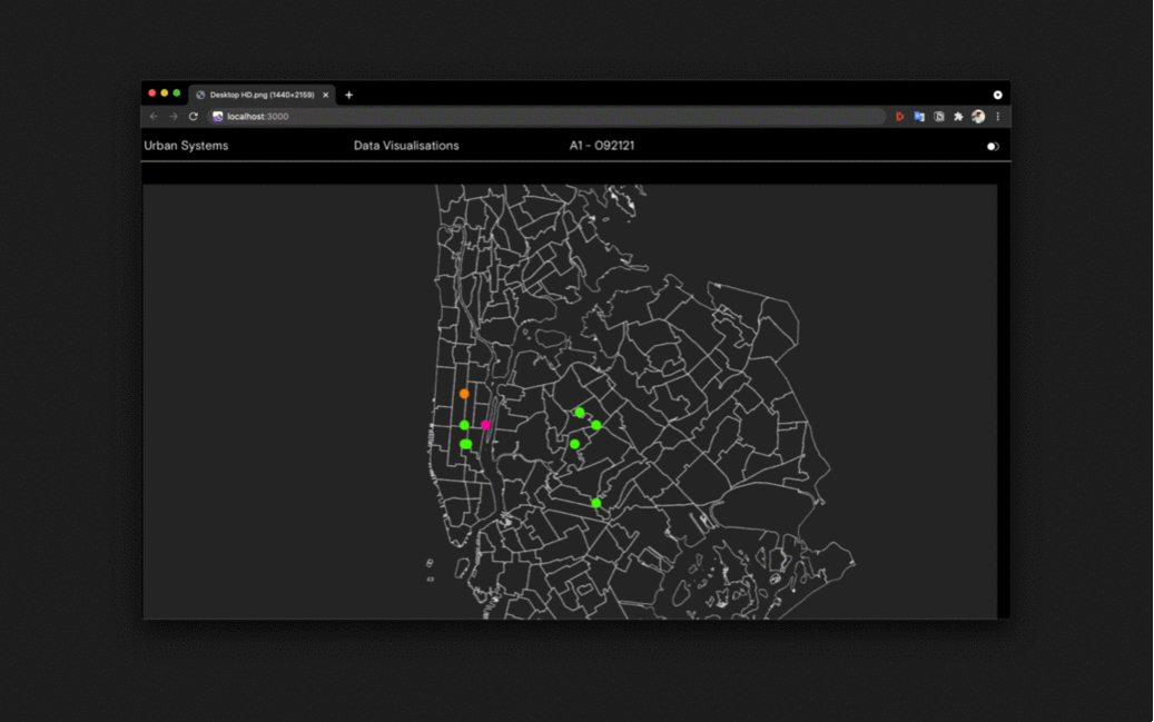
The final data visualization is a production-ready web application that embeds an interactive map.
- A dataset containing all LinkNYC Locations to map the physical booths
- A dataset to map the NYC Subway to create a user context for patterns in another location-based dataset
- Interactive geospatial data visualization in Kepler.gl
- Fully responsive web application in ReactJS and NextJS hosted on a publicly available URL with Vercel to enable self-hosted datasets.
- Custom Mapbox and D3js (Javascript) integration-ready
- Over 1869 data points mapped in a 3D canvas in WebGL
- Important:However, the visual is currently missing a fitting dataset for mapping inequality
Conclusion
The current visualization lacks a straightforward dataset to map inequality. Thus, we can not establish a correlation between the location of the LinkNYCs and its equality to the neighborhood.
During the second iteration, it became clear that Census Median Household Income did not represent inequality necessarily. After removing the dataset, we did not find a relevant dataset to prevent bias-based solely on income. However, we discovered that the equation to measure inequality is exceptionally complicated. As a result, we reached out to the Atlas of Inequality team of the MIT Media Lab in the hope of getting access to their highly accurate measurement endpoints of location-based inequality. If we aquire this data, we hope to merge the current visualization with their data points. Eventually, we aim to create an engaging story to explain if the neighborhoods that needed the most public WiFi have been left out.
- Daan van der Zwaag
- dv239@cornell.edu
- 21st of September 2021
- Assignment 1: Hard Systems
- INFO5410 Urban Systems by Michael Samuelian
- Dual MS Urban Tech at Jacobs Technion-Cornell Institute, New York City