After moving to New York this year, I wondered what the most affordable location in New York is while staying within my student budget and close to the F-Train. While this might seem like a tedious task and not yet possible, public social-economical data can help map location affordability. This data visualization maps the relation between income and cost of housing in New York City per income group and amount of household members per Census tract.
To start this process, we first have to find geospatial data around income, housing costs, and other expenses like travel. The latter is essential if someone has to take transport twice every day they spend money on gas or tickets. So if you live close by your work, perhaps a higher rent would be more valuable than travel time and travel expense. Also, it is crucial to know the definition of a household and its income. A single-parent lower-income person would have a different definition of affordability than a married young professional couple with a higher income range. So knowing these externalities is essential to find a fair number to rate a location in its affordability.
Terminology
First, define our terminology in exercise. The affordability term is simplified for this exercise, and we know that actual affordability is more complex than we explained.
- Median household income (Hi): median monthly income of people in the same census tract in US dollars
- Average monthly housing cost (Hc): costs such as rent, mortgage, and utilities in US dollars
- Transportation costs (Tc): costs like gas or public transport tickets in US dollars
- Number of households (Ht): the number of households in a census tract
- Location: geographical location defined by Census tract ID, often a neighborhood, area, or block.
- Affordability: the rate of housing costs + travel costs divided by income in ratio to the local median income in the local area
(Hc + Tc) / ((Hi - Ht) * 100)
Identifying the system
From here, we can identify the different elements of this soft system. For starters, we are talking about social-economical systems since income and costs are being used to map the network. The flows are based on the citizens moving into the housing and after spending their income, compared to people around them on housing and travel costs. Therefore we could define the system as follows;
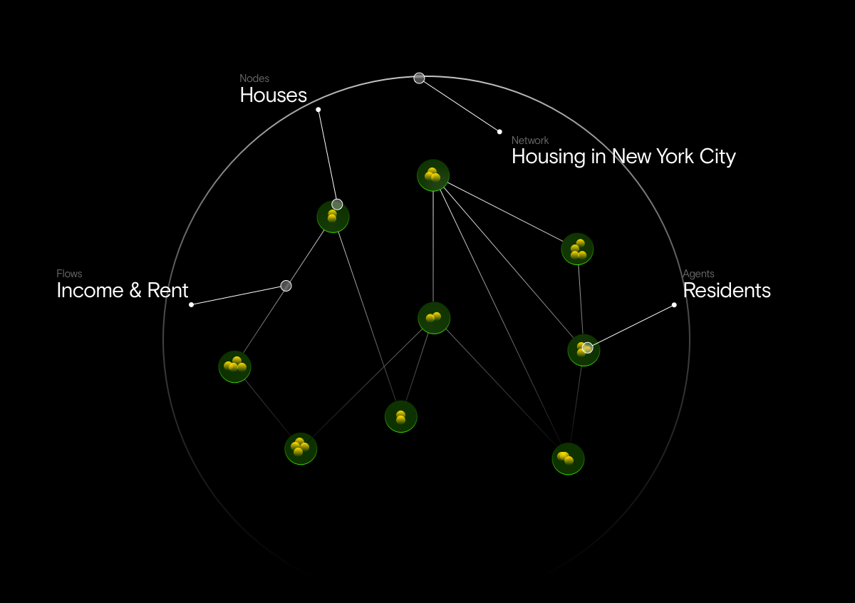
- Network: Housing System in New York
- Nodes: Houses
- Agents: Residents
- Flows: transactions for income, rent, and transportation

Finding data
Most of this data can be accumulated by merging multiple public datasets. For example, Income Data Table (Census, 2020) , American Community Survey (Census, 2013-2016) , and Zillow Housing Prices (Zillow & Kaggle, 2020). However, during our research, we found the historical dataset that merged certain factors to determine affordability. This national initiative by the HUD Exchange is described as follows "The Location Affordability Index (LAI) works to close this gap by providing estimates of household housing and transportation costs at the neighborhood level along with constituent data on the built environment and demographics."
(HUD, 2020).
Along with the LAI 2013-2016 dataset (1) (HUD, 2019), we will use a local street name index dataset (2) to match up to our census tract geospatial data to addresses in the city. Also, we need to convert Census numerical FIPS data to readable names f.e 047 is Kings County with a TAN Table converter dataset (3). Moreover, we could add the subway lines (4) to create an interesting visual element through the visualization, but adding this data is optional and for personal reasons only.
Cleaning the data
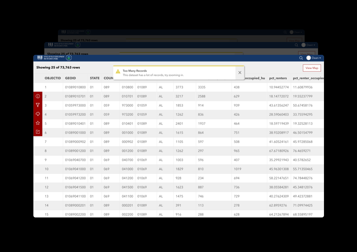
Since the LAI index is data-heavy with a total size of 29,652,726 (402 * 73,763) thus, we need to clean the data to our project's scope. This will optimize the performance later on and make calculations easier. Also, having non-numerical data makes the User Experience more pleasant.
- There are over 73,763 records (rows); we need only the state of New York, NY, and preferable the five boroughs of New York City.
- Preferably, we condense the number of parameters (columns) from 402 to just the required columns.
- Convert Census tract numbers to readable names and copy this to the primary data frame.
Visualizing the data
We are using our custom React web app setup from the last project, Hard Systems - NYC Link Kiosks, and embedding a new external geospatial storytelling map.
Since we learned that using Keplar could sometimes be more restrictive, we decided to learn to use ArcGIS Online. After taking a short tutorial, it became clear this was the right tool for the job and allowed more complex data calculations. After loading the three different datasets, we started calculating on the fractions and normalizations rates in the data to find a tension between aesthetics and practicality. We styled the data with SVG filters ap such as blend modes, bloom, and shadows. Moreover, a custom color palette was adapted from the last exercise and improved the legibility of the dark interface.
The gray to green gradient in the visual will vary based on "Average monthly housing cost divided by Median household income," and the transparency of the field will be determined by "Housing and transportation costs as a percent of income for Median-Income Family households divided by Number of households."
Analysis
If we look at visualization, we can immediately see the network structure through the difference in green spots over the map. Where a more affordable location indicates a green/yellow zone, the gray areas tell us that the nodes in that location are not affordable. This is in line with expectations that Manhattan is more expensive than the other boroughs. Moreover, it is interesting to see spots occurring within a lot of gray areas. Perhaps the flows in these spots are not mapped due to a high rate of office spaces or industrial zoning.
Action-oriented future
As Andrew Yang, an NYC mayoral candidate said to the New York Times: The system is broken, and we need a new way of delivering affordable housing to New Yorkers,"
(New York Times, 2021) Perhaps smart-city algorithms can make sure affordability rates stay stable throughout specific locations where there is a lot of disparity throughout every income group. Possibly, by recognizing rate changes over time and predicting patterns, certain areas can stay affordable for people who need it the most. By automating the zoning process or adjusting hyper-local legislation, a data-driven decision-making process can help policymakers remain objective. However, since an AI would influence daily lives, an ethical board could accurately evaluate the open-source models.
Today, I will look at housing in the neighborhoods lit up on the map.
- Daan van der Zwaag
- dv239@cornell.edu
- 25th of October 2021
- Assignment 2: Soft Systems
- INFO5410 Urban Systems by Michael Samuelian
- Dual MS Urban Tech at Jacobs Technion-Cornell Institute, New York City